
01 / Light in a material
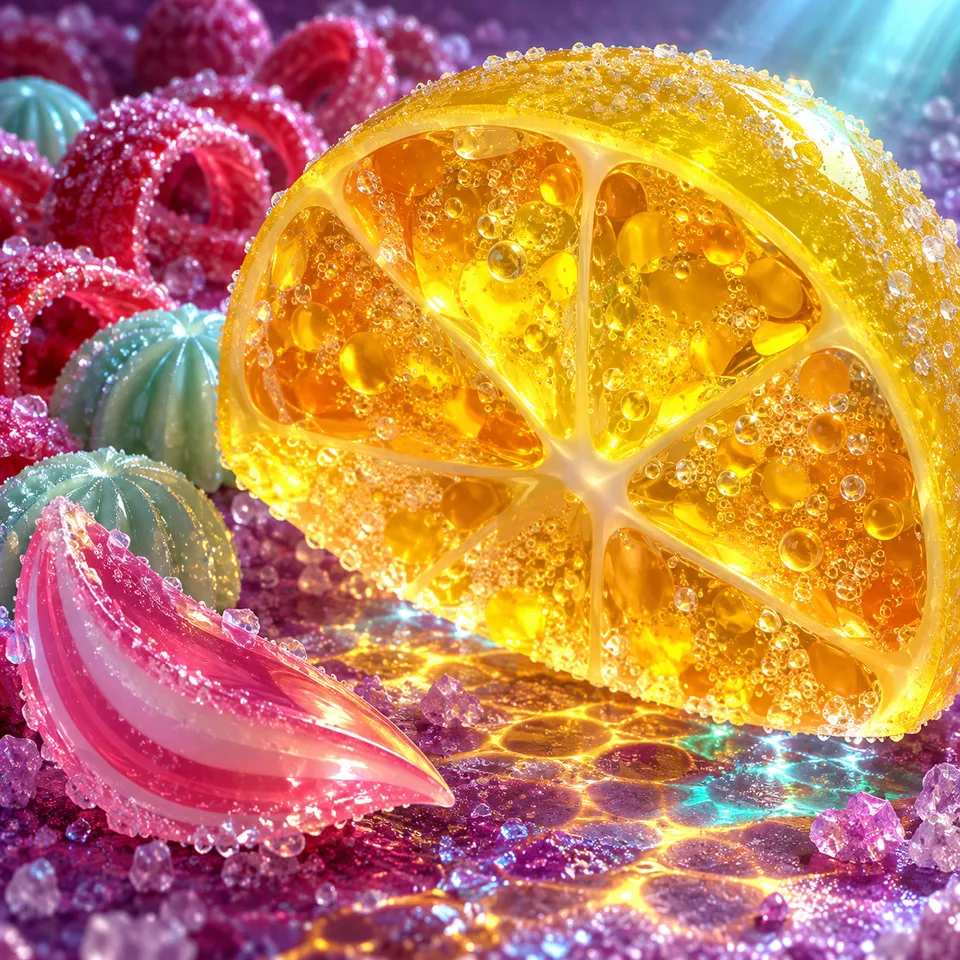
Begin with the citrus lens. Its sharp white highlights sit on the surface, while the warm amber colour seems to sit inside it. The tiny bubbles add another layer: some are clear, some bright, some almost lost in the jelly.
This is an artistic impression of translucency. A convincing image does not need every part to shine equally. If every edge were equally bright, the slice would begin to look flat.
02 / A path through a picture
The ribbon current moves upward through a tall frame. The soda spiral moves around a centre. The bonbon grotto leads from a large foreground sweet towards a thin stream in the distance. Each gives your eye a different route.
- Cover half an image with your hand. Which part still tells the story?
- Find the largest shape, then the smallest repeated one. Notice how their spacing changes.
- Trace the brightest line without naming any of the sweets. Does it carry you across, around or into the scene?
03 / Colour and contrast
A bright colour can feel brighter when it sits beside a darker one. That is why deep violet water is useful here: it gives the pink and aqua highlights somewhere to emerge from.
In the observatory, move the sample marker from one end to the other. The contrast number changes because a gradient contains many colours. White text might work over one part and become difficult to read over another.
For a practical layout, place important words on a stable surface and check the actual result at the size people will read it. The solid-swatch calculation is a useful observation, not a substitute for that review.